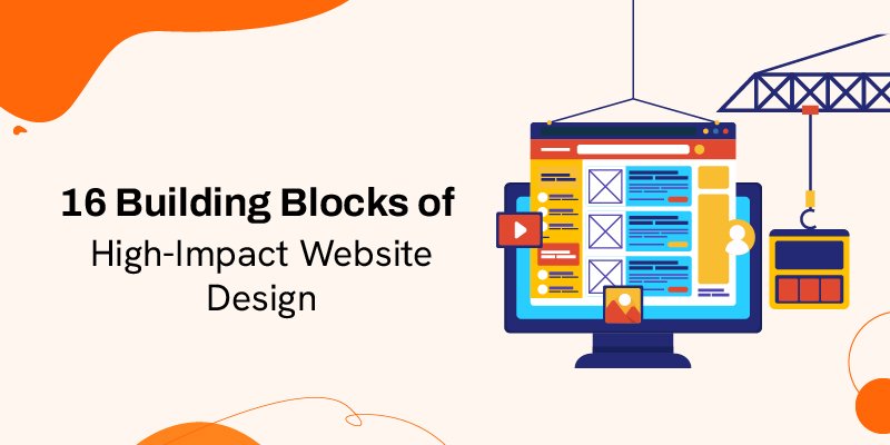
16 Building Blocks of High-Impact Website Design
Thanks to advanced technology, building a website today is extremely simple. However, designing a website that marries impeccable functionality with stunning visuals is still challenging.
This goes without saying; websites are now a fundamental part of a business’s online identity.
No business can hope to survive, let alone thrive in today’s cut-throat market, without an attractive, easy-to-navigate website. You have no idea how many businesses fail at building a substantial online presence for their brand because of a subpar site.
So why do some websites fail to attract and hold traffic where others succeed?
Well, certain elements of a website design contribute the most to building visitor interest in a website.
Their inclusion on the site gives it a beautiful visual appeal along with flawless functionality and authority. These are also the components that are botched the most during development.
So let’s look at all 16 of these elements that are critical for building a great website.
1) Colour Schemes
The colour scheme of a website is seldom paid attention to when developing a website. However, you should know how important of a role they play in influencing a visitor’s behaviour. Therefore, it is important to use a colour scheme that will best appease your visitors while representing your brand.
For instance, if you quickly go to the fast-food giant McDonald’s website right now, you’ll be greeted with a colour scheme that combines red, white, and yellow. These colours have been synonymous with the brand for ages.
We suggest first choosing the dominant colour that best represents your brand. You can then choose an analogous colour scheme that complements your dominant colour choice to highlight certain sections of your site, like the CTA buttons.
2) White Space
Open any website today, and you’ll find a majority of these websites possess white spaces that divide certain sections on them.
These spaces lend an immaculate and accessible design to your site. They make the content or CTA buttons on your site easy to identify and read for visitors.
Some websites also use these spaces to give certain aspects of the site more emphasis than others. For instance, white spaces can make certain ‘special deals’ the focal point of a page.
Make sure you’re consistent in spacing the gaps between sections of your site. We recommend beginning with the navigation and then moving your attention to the content of your site. A grid-based layout can help you design a clean interface that maintains consistency across the entire page.
3) Easy Navigation
Sites that make it complicated for their visitors to navigate normally experience higher bounce rates.
As such, it is imperative to facilitate simple navigation by giving users an easy-to-use and intuitive website.
The website should offer users simple routes to navigate to certain fundamental aspects of a site, recommended pages, along with a way back to the original page.
Take a look at this quick navigation menu bar in Marks and spencer’s.

We suggest using parallax scrolling as a navigation system that includes arrows that make a website’s UI easy to interact with. Suffice to say, one must emphasize simple navigation if you wish visitors to spend more time on your site.
4) Distinct Typography
Using unique typography to present content on your site is ideal for distinguishing yourself from other similar sites online.
The font you ultimately choose should complement your brand while communicating its message to visitors. It is also important to consider a font that makes your site look professional without appearing bland.
We suggest using a font size of at least 16 pixels to make your site’s content readable on mobile and desktop devices. You can use different but complementary fonts to highlight the headings and subheadings on the site.
Finally, use contrasting colour schemes to match your text with the background perfectly. Pairing darker tones with lighter colours will do the trick just fine.
5) The Visuals
This goes without saying, but certain visual cues on your site will give any website a distinct edge over similar websites online. Populating a webpage with HD images and beautiful illustrations can make your site more compelling to visitors.
For E.g., Take a look at this HD image from Hershey.

Of course, you cannot use any random visuals on the site; they should align with what your brand stands for.
Use stunning banner images. You can populate your page with custom-made images, which can also be used to highlight certain key focal points of your site. Try to avoid using too many stock photos on your pages.
6) Site Usability
Aside from beautiful design, you also need to ensure a site that provides users with a satisfying user experience. Most developers make the fatal mistake of compromising a site’s usability in favour of its overall visual design.
It is imperative to optimize a site to facilitate smooth interaction between the site’s elements and visitors. A subpar experience could result in your website’s bounce rate blowing through the roof.
You can enhance the user experience by using animations, readable and engaging content, simple navigation, and a more interactive site.
7) High-Quality Content
Having high-quality content is integral to optimizing the search engine rankings of your site and thus drawing your site.
They are also important to keep your visitors engaged. High-quality content relevant to your site can persuade visitors to spend more time on your site, explore other areas or make a purchase.
We recommend dividing your content based on its relevance. Always keep relevant information about your website, product, or service at the top. Follow it up with content that explains your services or highlights features that set you apart from competitors.
Finally, use an FAQ section to answer questions that a visitor may have about your service.
Have a look at this FAQ page design from shopify.

8) Compelling CTA
A website exists to persuade a visitor to take certain actions on it. CTA buttons on a site trigger this response from visitors.
As such, you need to place CTA buttons strategically throughout your page to persuade visitors to perform desirable actions on the webpage.
The ‘call to action messages themselves must be persuasive. They should explain what you want visitors to do in a few words.
‘Buy Now, ‘Sign up Free,’ ‘Contact Us,’ etc. are all examples of CTA buttons commonly used by most websites.
Make sure your landing page leads users to all the CTA buttons present on the page. You can utilize contrasting colour schemes, content, and white spaces to highlight a CTA button.
Have a look at this CTA button used by Spotify.

If you have a variety of CTA buttons on your page, determine which is more important and use it more prominently.
9) Mobile-Friendly Design
It is a known fact that most websites receive most of their traffic from mobile users.
There are over 7 billion active smartphone users around the world today. Not optimizing your site for mobile devices means losing such a massive audience. Suffice to say; mobile optimization is one of the first things you need to do when building a website.
You need to utilize a custom web design that responds and adapts to various mobile screen sizes automatically.
We recommend using Google Search Console or other free tools like Pingdom or BrowserStack to check whether your site is mobile-friendly.
10) SEO Friendly Elements
As you may know by now, search engines like Google take many aspects of a site’s user experience into consideration when ranking a site.
As such, a developer needs to consider search engine optimization from the very beginning of a website’s design process. Elements like simple navigation, scannable text, loading speed, and
mobile-friendliness contribute to the overall user experience.
A problem with any of the above elements will result in a user having a poor experience with your site, eventually increasing its bounce rate. Google will take this high bounce as a sign of bad UX and ultimately shoot you down in search engine rankings.
It is imperative to consider how each element will contribute to your site’s SEO. We suggest working with an SEO expert, who will monitor and assess all crucial elements of your site while it is in development.
11) Right Usage of Advertisements
You’ll find many websites online that have successfully monetized their websites by displaying ads on them. If used appropriately, display ads can be a great way to earn some revenue from your website.
However, such advertisements, if used incorrectly, can aggravate your visitor’s user experience. Suffice to say; advertisements have the power to make or break your site.
As such, we discourage using too many ads on websites as it can harm the user experience. You don’t want your website to look unprofessional, which is exactly what will happen if your webpage is littered with ads.
The most effective way to advertise on a site, in our opinion, would be combining banner ads with affiliate marketing. Make sure your ads integrate organically with your site. They shouldn’t feel out of place and interfere with the content on your site.
12) Security Proof
Online security should be an integral part of any website. Security and privacy have often been a major cause of concern for individuals surfing the web. Security alerts popping up when someone tries to open your site is a sure-fire way of turning potential website visitors away forever.
Internet security should be given as much focus as the design and overall functionality of your site. It should be mandatory for your website to implement an HTTPS protocol. This will help protect a user’s information, lend some much-needed credibility, and build trust among prospects.
We suggest buying SSL certificates from reliable hosting service providers. You can avail of them for cheap and integrate them seamlessly with your site.
13) Integrating Social Media
Social media platforms like Facebook, Instagram, and Twitter have billions of active users from all around the world. So, it only makes sense to integrate social media into your site’s design plan.
You should have social media buttons that instantly redirect your users to your site’s official social media channel.
You can also have buttons that allow users to directly share certain content or product from your website on their private channels.
Having social media buttons placed strategically on your website is a great way of indirectly marketing your site, opening doors for people to leap in directly onto your site from their respective social media profiles online.
14) Integrating Internal and External Links
A proper link-building strategy can prove to be a great way of enhancing the brand authority of your website.
It is important to learn how to build internal and external links to help boost your website’s performance. For instance, you can direct users to certain content on your site and improve its SEO performance by using appropriate internal links.
Proper link-building research requires a good strategy. We suggest finding out how your competitor websites are employing their link-building strategy. Draw inspiration for sites that are using the strategy with productive results.
15) Add a Comments Section
We’ve already stressed how important it is to make your site as interactive and engaging as possible.
Aside from content, you can add a comments section to your site, which allows users to leave their two cents below a particular content or product information. This can be a great way to receive feedback, which can be used to improve your service.
If you are running an eCommerce store, we recommend adding a review section similar to what is found on sites like Amazon and eBay. A dedicated comments and reviews section will make your site more interactive and improve brand loyalty.
16) Add an Achievement and Validation
This is perhaps the most effective and widely adopted way of building trust among customers. It is in your business’s best interest to flaunt your past achievement on your website for all to see.
Display your achievements can go a long way in building a solid reputation for your business and brand.
We recommend having a section for testimonials, which display positive comments from at least 4-5 past clients.

We also suggest highlighting the names of all the popular brands you’ve served. If you’ve achieved validation from authority brands, add them to your site as well.
